John Mclean
momentum
24 APRIL - 6 JUNE
-
-
For over 50 years, John McLean determinedly pursued abstraction and colour. In an exhibition that charts work from the mid 1960s through to 2019, all drawn from the artist’s estate, John’s early interest in Abstract Expressionism, his time spent in the US and Emma Lake, Canada, and his London life where he lived from the 1960s is recorded. John’s work refuses neat division into chapters; throughout his life he experimented and ideas that are seen in their infancy re-emerge years later in their maturity. Shapes and motifs weave their way through the decades. John worked relentlessly but perhaps never more so than in his final years, when even holding a paintbrush was problematic, his colossal drive kept pushing onwards.
-

-
-
Selected works are on display at The Fine Art Society.
all other work is available to view by appointment. Prices include framing. Not all un-exhibited work is framed so please allow time for framing if purchasing online.
Click here to view the work on display only.
Text is taken from Ian Collins' excellent monograph John McLean, published by Lund Humphries in 2009.
- This Viewing Room charts a history through John's artistic development, beginning with his early Op Art works of the 1960s and moving through loosely chronological explorations of colour, form and composition. All artworks and photographs of the artist are included with thanks to the artist's estate. All work is for sale.
-
"...undecided whether to study art history or practice, but eager for London, John had applied to the Slade School and Courtauld Institute. Both accepted him... London meant life with Jan, painting afresh in the hub of things and the excitement of the Courtauld Institute." pg.32
"The work of colour-field and acrylic pioneers Noland, Louis, Jules Olitski and Friedel Dzubas - all impacting on the subsequent McLean career - was first encounted in 1960s London at landmark shows in commerical venues such as Kasmin and at Bryan Robertson's Whitechapel Gallery. He was learning by looking and doing." pg.40
-
"[1965] saw a joint exhibition with fellow Courtauld student Michael McLeod at the A.I.A. gallery in London's Soho... There was also a favourable review in the Guardian by its new art critic Norbert Lynton - who compounded the compliment by buying two paintings. He wrote: 'John McLean's ten paintings and collages come under the heading of Op Art in that he exploits conflicting colours that shift and pulsate, but he joins to this not very noteworthy function programmes of pattern modulation and transformation that lift his pictures out of the run of eye twisters. And, in fact, some of his work is gentleness itself." pg.40
-
"The paint I used was a mix of artist's acrylic with house painter's white emulsion which went on flat: no brush strokes. A lot of contemporary work I looked at had a beautifully made mechincal look. Often it was in black and white, but I was interested in closed-toned colour contrasts. The greenish yellow ground of Quadrillion and the warm blue squares are near enough complementary to be lively but not so obvious as to kill the harmony.
Although the squares lie still, parallel to the picture edges, they also, because of the way they are grouped, seem to move diagonally backwards and forwards. I wasn't aware of it at the time but, with hindsight, that visual ambiguity was to be a constant in my painting. - John McLean" pg.45
-
-
-
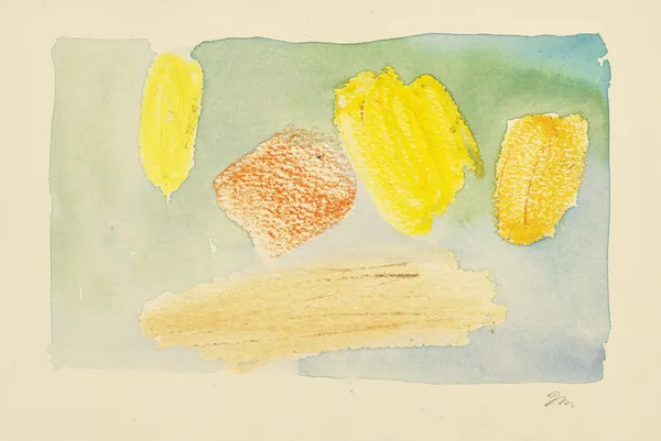
John McLean, Untitled, 1970s£ 2,500.00
-
John McLean, Untitled, 1970s£ 2,000.00
-
John McLean, Untitled, 1970s£ 2,200.00
-
-
-
-
-
John McLeanPlan for a project, late 1960spencil and collage on paper7 ¼ x 15 ¼ inches (18.5 x 39 cm)John McLean, Plan for a project, late 1960s£ 1,200.00
-
-
-
-
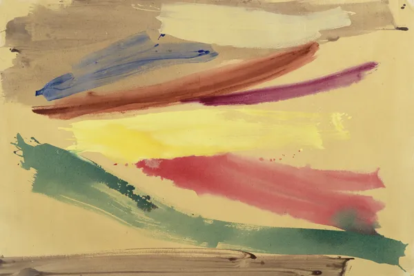
"Then, for the summer of 1981, John quit a part-time teaching post at Winchester College of Art with his old and dear friend Gillian Ayres, to become guest artist at the University of Saskatchewan's Emma Lake workshop. Founded in 1936, the gathering had grown into a major international creative exchange with visiting critics, curators, painters and sculptors...
With further visits over ensuing summers, Saskatchewan's Saskatoon city came to rival New York in its influence. In a letter to Jan he wrote of having his work 'satisfactorily bright and bold'... Prairie panoramas were soon suggested in elongated canvases bathed in a light ranging from glowing to searing." pg.62
-
-
John McLean, Forza, 1970£ 700.00
-
John McLean, Haven, 1990£ 2,200.00
-
John McLean, Grove, 1983£ 650.00
-
John McLean, Untitled, 1980s£ 650.00
-
John McLean, Untitled£ 750.00
-
John McLean, Untitled, c.1989£ 1,800.00
-
-
John McLean1939-2019Untitled, c.1981acrylic on canvas67 ¾ x 134 ¾ inches (172 x 342 cm)P. O. A.
- "'You can't find brighter light anywhere in the world', the artist says. Slabs of colour began to shimmer against golden grounds like a mirage in a harvested cornfield so cast it mimicked a desert - a vision of building blocks striding towards a towering future. 'In my studio one day Dorothy Knowles joked that coming to Canada had been my undoing', John McLean adds. 'What it really did was help me on the road to using saturated colour." pg.65
-
-
-
-
"In summer 1987 the McLeans moved to New York and stayed for two years - John working in a huge Soho loft...
The New York move ultimately led to a big breakthrough - back in London. A 1988 debut at the Francis Graham-Dixon Gallery in Clerkenwell comprised a selection of American paintings. Tim Hilton asked in the Guardian: 'Surely there is no other British artist with a comparable desire to produce paintings of sheer and utter beauty?'...
Hilton saw a characteristic McLean painting of that moment as having 'swathes of pigment that shelter or enclose a lighter-coloured area, which might be a rough, sprawled rectangle or an open wedge-like triangle. Such areas are usually lighter because they are the canvas itself, unpainted. Within them, they have long, bold, separated marks of colour. One must read the colour abstractly, but there is none the less a metaphor in the format. Since the inner components of the painting are in a higher key than their embraing swathes the effect is of exposure and display; and this is a device of Western art that goes back at least as far as Titian, whose paintings often flung back sumptuous curtains to reveal a central feature, and thus concentrate on it...'
'McLean's painterly hand does not impose: it seems to elicit what the canvas and the pigment are in themselves. Here is one of his modern masteries. Old-master paintings, embalmed beneath their dense finishes, have the look of finality and of definite empirical knowledge. Modern painting is by contrast insubstantial. McLean's abstraction goes further: it says that optical experience is the most delicate and fleeting knowledge that is given to the human senses.'
Back in Britain, at the end of that decade enriched by the grandeur of North America, John McLean was to conclude:
'I want a simple heroic style like Raphael or Michelangelo. I don't want little details. I'm interested in big effects." pp.65-67
-
-
John McLean, Garioch, 1986£ 8,000.00
-
-
On his 1986 work Balustrade (private collection):
"A busy colour riff plays against a simple ground divided into two: a peninsula of pale warm in a sea of crow black... As the 1980s went on I began leaving close tonality further behind." pg.78
-
-
John McLean, Untitled£ 1,500.00
-
John McLean, Untitled£ 1,800.00
-
John McLean, Untitled, 1989£ 1,400.00
-
John McLean, Untitled, 2009£ 950.00
-
-
John McLean, Untitled, 2009£ 950.00
-
-
-
-
John McLean, UntitledSold
-
John McLean, UntitledSold
-
-
-
John McLean, Gate, 1986£ 500.00
-
-
John McLean, Untitled, c.1986£ 500.00
-
-
-
On Strathspey, 1993 (Glasgow Museums):
"The huge 1992 Matisse retrospective in New York was very moving. So was the Miró show in Barcelona soon afterwards. But for the previous decade I had also been looking at the painting of Bill Perehudoff, the Canadian abstract artist, whose colour intrigued me. I longed to use absolutely saturated hues as he did and by the time I painted Strathspey I could.
The upper circle is the white ground, in a sense a hole in the more brushy black field. But some of the bright colours overlap the black, so the hole seems to move forward on to the same plane as the black. White will always come forward, no matter what, but my ground here is a flat white and would be in a sense obviously behind the slightly translucent black brushed on top. Spatial tension is central to my work." pg.85
-
-
-
John McLean, Study for 'Strathspey', 1994£ 750.00
-
John McLean, Calm, 2003£ 1,800.00
-
John McLean, City Lights, 2004£ 1,800.00
-
John McLean, Untitled, c.2000£ 3,800.00
-
-
-
John McLean, Hammerbeam, 2000£ 1,200.00
-
John McLean, Caporal, 2001£ 1,100.00
-
John McLean, Working proof for 'Dawn', 2001£ 850.00
-
- "The floating shapes that are none the less resonant of the moon, wings, maple seedlings or whatever, have evolved through compositional considerations more than anything else. I would of course admit, indeed rejoice in their having overtones of forms in nature, but would also point out that they gain strength, meaning and universality from their mere configuration - the way, for example, they often reach out to the four corners of the canvas. - John McLean" pg.93
-
-
John McLean, Shoal, 2009£ 1,200.00
-
John McLean, Untitled£ 1,100.00
-
John McLean, UntitledSold
-
John McLean, Untitled, 2011£ 850.00
-
John McLean, Giallo, 2007£ 1,200.00
-
John McLean, Inchgrundle, 2011£ 3,800.00
-
-
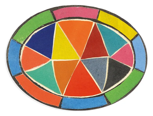
- "[In New York, c]ommercial work was finally secured through an agent - notably circular designs on paper, with motifs based on Della Robbia pottery, for an Italian restaurant chain. That tondo format proved useful practice for later acrylics and prints." pg.65
-
-
John McLean, Untitled£ 800.00
-
John McLean, Surgant Venti, 2004£ 1,400.00
-
John McLean, Dusk, 2006£ 1,500.00
-
John McLean, Mingardo, 2007£ 1,800.00
-
John McLean, Untitled£ 1,200.00
-
John McLean, Full Plate, 2006£ 1,200.00
-
-
-
-
John McLean, Untitled, c.2008£ 1,000.00
-
John McLean, Avanti, 2008£ 1,000.00
-
-
-
John McLean, Cantrip, 2008£ 700.00
-
John McLean, Untitled, 2010£ 600.00
-
John McLean, Oxter, 2008£ 800.00
-
John McLean, Untitled, c.1991£ 2,600.00
-
John McLean, San Trovaso, 2012£ 3,800.00
-
John McLean, Untitled, c.1990Sold
-
John McLean, Untitled, 1990s£ 2,000.00
-
John McLean, Untitled, 1990s£ 2,200.00
-
John McLean, Untitled, 1990s£ 1,800.00
-
-
-
-
-
-
John McLean, Untitled, 2017£ 6,000.00
-
-
-
-
John McLean, Fable, 2005£ 2,500.00
-
John McLean, Untitled, 2000s£ 3,800.00
-
John McLean, Kirk Wynd, 2005£ 4,000.00
-
-
-
“Since 1992 John McLean’s paintings have evolved in a dramatic direction after twin big-bang convulsions. Previously he had tended to play with combinations of close-valued colour. Now black becomes as central to his work as it was to that of two of his heroes: Goya and Manet…
Epiphany for McLean came via the Matisse retrospective curated by John Elderfield at New York’s Museum of Modern Art in autumn 1992, and the Miró centenary show, in Barcelona, the following spring. The effect on McLean, a fan of both artists, was electrifying as he began to perceive the positive possibilities of black as a colour rather than a dark value. Lustre could lift any composition – especially with mica added to the pigment in the formulations of Sam Golden. And if black did have a quietening and darkening presence, then surely it served only to make other colours brighter and livelier?” pg.100
-
-
John McLean, Sagra, 2009£ 450.00
-
John McLean, Drumtochter, 2008£ 4,200.00
-
John McLean, Drumsturdy, 2009£ 950.00
-
-
-
-
-
-
John McLean, Giocoliere, 2009£ 7,000.00
-
John McLean, Gioco, 2009£ 7,000.00
-
John McLean, Gioia, 2009£ 7,000.00
-
-
-
-
-
John McLean, Dancing figuresSold
-
John McLean, Untitled, 1972£ 3,000.00
-
-
-
John McLean, Untitled£ 800.00
-
John McLean, UntitledSold
-
-
-
John McLean, Mural maquette, 2010£ 800.00
-
John McLean, Mural maquette, 2010£ 800.00
-
John McLean, Mural maquette, 2010£ 800.00
-
-